My strategy for Bar chart is easy as eating a pie ,it got me 90 and there is no doubt if you follow it you will be able to speak fluently for 40 seconds about the main points in the graph.
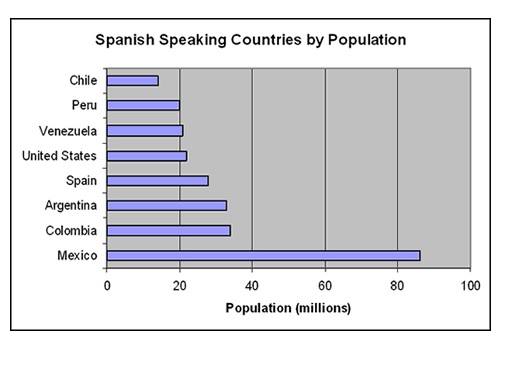
1. Define the title : This bar graph reveals/portrays/shows an information regarding Spanish speaking countries by population.( Title)
2. Define x axis : The horizental axis express the population in millions and ranges from 0 to 100 million
Whereas ( Linking word ,helps you with fluency and organisation of the chart )
3. The vertical axis shows different countries such as Mexico, Chile ,Peru etc.
4. According to the graph ( Linker)
say the highest for example in this graph
The highest population of Spanish speaking people is in Mexico , approximaately 83 million
Whereas ( linking word)
5. Say the lowest for example ,The lowest population of spanish speakers is in Chile .
6. ( Optional if time permits) Apart from this ( Describe any other trend in the graph ,this can be similarities or differences or any other stats for example
Apart from this Argentina and Columbia has almost similar number of spanish speakers
or Apart from this USA has more spanish speakers than Chile and Peru.
7. Conclusion ( very important ) Draw any conclusion
In Conclusion ,Mexico has the highest Spanish speaking residents in the world